Category Archives: Sign Design
 Take a look at these two signs. They both appear to be sandblasted wood signs. There is a big difference between the two though, and I don’t mean the colors. Can you spot what it is? The difference is one sign will last much longer than the other, and save the customer money. One of the signs is wood, and the other is PVC.
Here in Florida, a lot of people prefer wood signs. The natural look is a preferable appearance, and they’re structurally strong when new. Wood signs have been the standard in the sign industry for many years. There are some down sides to wood signs though. Wood signs can warp or lose their shape, faster in some areas than others. Termites and carpenter ants bore into them. Wood signs also rot, especially here in Florida where a lot of sign locations are wet.
 An excellent solution for these problems is PVC. PVC mimics the look of wood and is structurally solid as well. It’s also a common material that we are very familiar with. Bugs are not attracted to polymers like PVC, so insects are never a problem. PVC for signs is “closed cell” which means it resists moisture, so it doesn’t rot like wood.
So could you tell which sign is wood and which one is PVC? The Buckman Bridge sign is PVC, it will last much longer. You may be asking why people would choose wood over PVC if all of this were true. The answer is simple. Although many sign shops work with PVC, few are capable of mimicking the sandblasted, wood look. We have developed this process in house and use it exclusively on our dimensional signs. We still make signs in wood when a customer requests it, usually for interior use. Give us a call to find out more about our “made to last” products.
In the last blog post I wrote about exterior signs. This time I will cover interior signs.
 This sign for Silver Chiropractic and Wellness is one of my favorites. The color motif came together really well; the colors compliment each other. The letters are mounted on the wall using a silicone based glue. In order to keep all the letters level, we lay out a paper pattern and mark the location using a light powder. From there we can easily stick the letters on and clean the powder away.
 If you’ve read my last blog post, you may notice a sign similar in style to this one. The Riverside Dental sign has the logo graphics mounted onto clear acrylic with a frosted background. The letters themselves are metal. It’s a great look for an interior sign.
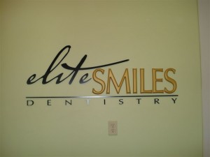
 Elite Smiles here is an excellent example of design proficiency. This shows how you can take different letter styles and arrange them to compliment each other. It’s about the little touches that all come together; the ‘T’ that crosses over the other letters, the line separating the words, and the way ‘Dentistry’ is spaced out. The sign comes together perfectly.

The Metropolitan is another example of a great design, it has excellent uniformity. One part of the sign that is interesting, is the word ‘The” that is offset at the top of the sign. It’s strange that it works out so well. You wouldn’t think it would look so good like that but it looks great.
 This sign for Chase Home Loans has a brass laminate finish. Each individual letter was cut using a CNC router for precision, and then polished in order to give it a shine. This brass finish is popular for financial institutions that want an upscale look.
Are you trying to think of a great sign for your business? It can be difficult to think of a good design, especially if it’s not something you’re used to doing. There are all kinds of elements involved; fonts, colors, logos, etc. For this blog post, let’s take a look at some different sign genres. My favorite signs are exterior signs, so let’s start with that.
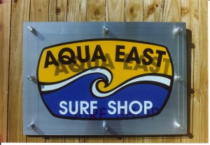
 AQUA EAST Here’s a wall sign for our friends at Aqua East. It’s a unique design. Start looking at other signs when you’re out, how many signs do you see like this? Along with its uniqueness, it’s physically attractive. This is important because in this world of excessive advertisement it’s the stand-out sign that draws people’s eyes and therefore business. What makes this really cool is the raised plexi-glass look.

OCEAN ARROW This is another beautiful wall sign. It’s a more classic design with a modern flair. The foam letters are mounted on stained wood. Notice the black and yellow and how well they go together, an excellent example of the proper use of colors.

THE ISLAND DENTIST I was going to leave this sign out of this blog. I wanted each sign to be different in style in order to present a broad spectrum of sign designs. I just can’t help myself though, this is one of the best examples of color usages. I have previously mentioned the importance of the impression that signs leave on people. Isn’t this a calming image? It looks like paradise, what a great idea for a dentist to use this scene. The impression it gives is relaxing and inviting.

WILLIAMS PLANT NURSERY Here’s what we call a two post sign. A two post sign has its advantages over other signs. It is easily installed in virtually any location. Ideally you want it facing a busy road for passers by to see. This is a great advertisement, notice how large the letters are. These styles of signs are also easily dressed up with a variety of landscaping.

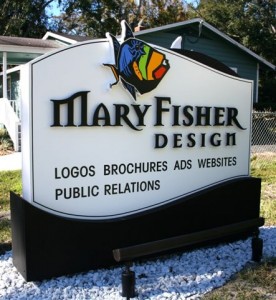
MARY FISHER DESIGN I think this is one of the more ‘striking’ signs. I like the black letters on the white background, classic. The logo is highly stylized (designed by Mary Fisher Design). The ‘M’ and ‘R’s in it have a subtle flair that is appealing. The fish speaks for itself, eye-popping. It is also a ground sign. It’s called a “monument sign” because it’s solid from top to bottom.

CLAY COUNTY UTILITY AUTHORITY I had to save the best for last. This is for the water utility company. They wanted to go big so they got it! The spicket appears to be bronze but it’s foam. This is one of those signs that steps out of the realm of advertisement and into the world of art.


Effective signage is made through effective design practices. There is a significant amount of psychology involved in sign design because signs are meant to communicate and persuade. The proper mix of colors, fonts, shapes, and sizes become an important part of the design process. Shimp Sign & Design understands what drives the potential customer and can make sure your sign design meets that need.
Generally speaking, a sign should be readable, attractive, and easily distinguishable from its surroundings. Stick to a few colors that will contrast with each other nicely. However, the sign should not stick out from its surroundings to a degree which alienates it from the general feel of the area. There needs to be a certain amount of harmony between sign and surroundings.
Equally important is that the message is communicated quickly and effectively. Signs that are organized and read easily are much more effective than the opposite. This is especially important for roadside signage as the drivers’ time to recognize and react is reduced. Changeable signs, which allow you to update your message, should contain as few words as possible. And having the correct letter size will ensure readability for moving traffic. For a professionally designed and cost effective sign, call Shimp Sign & Design.
 Take a look at these two signs. They both appear to be sandblasted wood signs. There is a big difference between the two though, and I don’t mean the colors. Can you spot what it is? The difference is one sign will last much longer than the other, and save the customer money. One of the signs is wood, and the other is PVC.
 An excellent solution for these problems is PVC. PVC mimics the look of wood and is structurally solid as well. It’s also a common material that we are very familiar with. Bugs are not attracted to polymers like PVC, so insects are never a problem. PVC for signs is “closed cell” which means it resists moisture, so it doesn’t rot like wood.
