Helpful information and news for planning your next sign project.
Take the time to read our blog. You will find many examples from our full-service professional sign company. Businesses and residents take advantage of our free consultation and estimates. See what you like best – and call us!
Daycare Signs
A Closer Look At Daycare Signs
Daycare signs are important marketing tools and need to be utilized in the same way other businesses utilize their signs. They need to look professional and appeal to children. When creating the sign, the process is fairly straight forward.
– Business Signs

When designing a sign for a business there are a few common factors that get sorted out:
How will the sign be mounted: Is it a ground sign, or will it be installed on the building itself? Or if you have a large front window, maybe you just need vinyl on the glass.
How far away is the road? Letters must be easily visible (and readable) from a car.
Do you have a logo or an idea of what you want on the sign? Click here for more information on logos and the sign designing process.
– Need A Daycare Sign For Your Home Business?
Are you planning on operating a day care center out of your home? You still need a sign, luckily there is a simple solution: yard signs.
Yard signs are a corrugated plastic sign with vinyl text and graphics. They are connected to metal prongs which simply press into the ground.
These signs are relatively inexpensive due to their availability. The biggest cost is in the design; do you have an idea of what you want?
The great thing about this is the straight forward, simplicity of the process; it’s as simple as placing an order and picking it up.
– Daycare Murals

What’s the first thing you see when you walk into a daycare? A giant mural on the wall. It’s always colorful with cartoon characters; it’s warm and welcoming. Kids love it and no daycare should be without it. There are a few ways to have this professionally done:
Some murals are printed on wall paper material which can be set up on the wall like regular wall paper. This is a fun process of simply looking through pictures of murals and deciding which one you like the most.
Hand-painted murals are also an option. This gives you the option to create your own mural which would be totally unique. Designing these cartoony characters is intimidating if you are new to the process, but it’s a fun process.
Some day care centers want to ‘dress up’ the place with designs around light sockets, above doors, or wherever necessary. These are fun, simple and inexpensive products.
– This should be an easy process
No matter what you’re looking for, there is a solution. Daycare signs have been around for a long time, and we are good at making them.
The sign design and install process should be straight forward. If you are confused by this process you can contact us and we’ll help you out.
Church Signs
 When looking for church signs, there can be many factors to consider. Maybe you’re looking to refurbish an existing sign, or maybe you want a completely new sign. There are plenty of options to suit what ever your needs may be.
The styles of church signs can vary greatly. A common option is to use changeable letters. These are easy to install and simple to work with. Anyone can easily switch out letters to send whatever message you would like. The step up from this style is to use a lighted, electronic message sign. These can be large or small depending on the customers needs and budget.
Materials for the base of these signs pictured(called monument signs) are diverse. Choices include brick, wood, stucco, PVC, (even a cost saving stucco-PVC hybrid) etc; each material has it’s own appeal. Many church signs look great using dark granite with gold leaf letters. Temporary banners come in handy to promote events. Banners come in many different sizes depending on the needs.
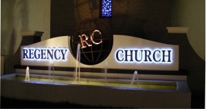 What really makes church signs unique is their shape. Some are basic two post signs with changeable letters. One of my favorite signs (designed by us) is the Regency Church sign. It is made from PVC, sprayed with stucco and has two faux brick columns on either side. The sign has a full length fountain in the front that looks great. A lot of church signs have crosses and various icons incorporated into the sign design. These icons, just like the rest of the sign itself, can be made of any material – wood, metal, stone, acrylic, etc. The process of making these vary according to the material being used. We use a combination of hand crafting and CNC routing to get any unique look that is sought after.
The installation of church signs is the same as any other sign type. Installation times will vary depending on the size and location. Larger signs may require concrete trucks to pour concrete for a solid foundation, according to local building codes. If this is the case, a section of dirt will have to be removed to insert a form for the concrete. The size of the form depends on the size and weight of the sign and is often specified by a structural engineer.
Before we do any installations, we have the area tested for any underground pipes, wires or cables. After we install the sign, we make sure the area is neat and clean. Any dirt removed during installation is hauled away. Our philosophy is that the sign should look like it was simply set in place. When finished, it will always be clean, level and appealing; a great reflection of its owner.
PVC vs. Wood
 Take a look at these two signs. They both appear to be sandblasted wood signs. There is a big difference between the two though, and I don’t mean the colors. Can you spot what it is? The difference is one sign will last much longer than the other, and save the customer money. One of the signs is wood, and the other is PVC.
Here in Florida, a lot of people prefer wood signs. The natural look is a preferable appearance, and they’re structurally strong when new. Wood signs have been the standard in the sign industry for many years. There are some down sides to wood signs though. Wood signs can warp or lose their shape, faster in some areas than others. Termites and carpenter ants bore into them. Wood signs also rot, especially here in Florida where a lot of sign locations are wet.
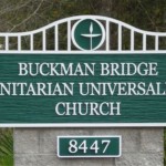 An excellent solution for these problems is PVC. PVC mimics the look of wood and is structurally solid as well. It’s also a common material that we are very familiar with. Bugs are not attracted to polymers like PVC, so insects are never a problem. PVC for signs is “closed cell” which means it resists moisture, so it doesn’t rot like wood.
So could you tell which sign is wood and which one is PVC? The Buckman Bridge sign is PVC, it will last much longer. You may be asking why people would choose wood over PVC if all of this were true. The answer is simple. Although many sign shops work with PVC, few are capable of mimicking the sandblasted, wood look. We have developed this process in house and use it exclusively on our dimensional signs. We still make signs in wood when a customer requests it, usually for interior use. Give us a call to find out more about our “made to last” products.
Different Sign Styles, pt 2
In the last blog post I wrote about exterior signs. This time I will cover interior signs.
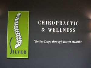 This sign for Silver Chiropractic and Wellness is one of my favorites. The color motif came together really well; the colors compliment each other. The letters are mounted on the wall using a silicone based glue. In order to keep all the letters level, we lay out a paper pattern and mark the location using a light powder. From there we can easily stick the letters on and clean the powder away.
 If you’ve read my last blog post, you may notice a sign similar in style to this one. The Riverside Dental sign has the logo graphics mounted onto clear acrylic with a frosted background. The letters themselves are metal. It’s a great look for an interior sign.
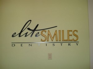 Elite Smiles here is an excellent example of design proficiency. This shows how you can take different letter styles and arrange them to compliment each other. It’s about the little touches that all come together; the ‘T’ that crosses over the other letters, the line separating the words, and the way ‘Dentistry’ is spaced out. The sign comes together perfectly.
The Metropolitan is another example of a great design, it has excellent uniformity. One part of the sign that is interesting, is the word ‘The” that is offset at the top of the sign. It’s strange that it works out so well. You wouldn’t think it would look so good like that but it looks great.
 This sign for Chase Home Loans has a brass laminate finish. Each individual letter was cut using a CNC router for precision, and then polished in order to give it a shine. This brass finish is popular for financial institutions that want an upscale look.
Different Sign Styles
Are you trying to think of a great sign for your business? It can be difficult to think of a good design, especially if it’s not something you’re used to doing. There are all kinds of elements involved; fonts, colors, logos, etc. For this blog post, let’s take a look at some different sign genres. My favorite signs are exterior signs, so let’s start with that.
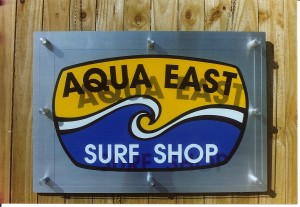 AQUA EAST Here’s a wall sign for our friends at Aqua East. It’s a unique design. Start looking at other signs when you’re out, how many signs do you see like this? Along with its uniqueness, it’s physically attractive. This is important because in this world of excessive advertisement it’s the stand-out sign that draws people’s eyes and therefore business. What makes this really cool is the raised plexi-glass look.

OCEAN ARROW This is another beautiful wall sign. It’s a more classic design with a modern flair. The foam letters are mounted on stained wood. Notice the black and yellow and how well they go together, an excellent example of the proper use of colors.
THE ISLAND DENTIST I was going to leave this sign out of this blog. I wanted each sign to be different in style in order to present a broad spectrum of sign designs. I just can’t help myself though, this is one of the best examples of color usages. I have previously mentioned the importance of the impression that signs leave on people. Isn’t this a calming image? It looks like paradise, what a great idea for a dentist to use this scene. The impression it gives is relaxing and inviting.
WILLIAMS PLANT NURSERY Here’s what we call a two post sign. A two post sign has its advantages over other signs. It is easily installed in virtually any location. Ideally you want it facing a busy road for passers by to see. This is a great advertisement, notice how large the letters are. These styles of signs are also easily dressed up with a variety of landscaping.
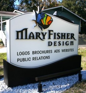
MARY FISHER DESIGN I think this is one of the more ‘striking’ signs. I like the black letters on the white background, classic. The logo is highly stylized (designed by Mary Fisher Design). The ‘M’ and ‘R’s in it have a subtle flair that is appealing. The fish speaks for itself, eye-popping. It is also a ground sign. It’s called a “monument sign” because it’s solid from top to bottom.
CLAY COUNTY UTILITY AUTHORITY I had to save the best for last. This is for the water utility company. They wanted to go big so they got it! The spicket appears to be bronze but it’s foam. This is one of those signs that steps out of the realm of advertisement and into the world of art.
Sign Installation nightmares.
Sign Installation nightmares.
Beware…
A sign installation can be a complex process. Even a small sign installation has its issues. When digging post holes (a basic, common process) the technician must be aware of underground power lines, fiber optic cables, irrigation lines, etc. A basic sign installation can turn into a big ordeal if the technician is not familiar with these issues.
It may seem farfetched but accidently cutting utility lines is a fairly common occurrence. Most irrigation lines are shallow and easily damaged. It has been reported in the local news that a man cut through a fiber optic line, shutting down ATM machines in a nearby shopping mall. Last September in Maryland, a man had to be hospitalized for accidentally cutting through an underground electric line with his post hole digger. Wouldn’t that ruin your day – hiring a sign contractor only to have him cut the power line to your building, injuring himself in the process? Or how about the story of one merchant whose electric sign shorted out and caused a building fire?
This is why it’s good to have a sign contractor that’s experienced in dealing with installation issues. It’s important that the contractor works with local companies that check for underground lines and mark their location accordingly. This way the installation is safe, quick and efficient; the job done neatly and professionally, no corners cut.
Sign Design Basics
Effective signage is made through effective design practices. There is a significant amount of psychology involved in sign design because signs are meant to communicate and persuade. The proper mix of colors, fonts, shapes, and sizes become an important part of the design process. Shimp Sign & Design understands what drives the potential customer and can make sure your sign design meets that need.
Generally speaking, a sign should be readable, attractive, and easily distinguishable from its surroundings. Stick to a few colors that will contrast with each other nicely. However, the sign should not stick out from its surroundings to a degree which alienates it from the general feel of the area. There needs to be a certain amount of harmony between sign and surroundings.
Equally important is that the message is communicated quickly and effectively. Signs that are organized and read easily are much more effective than the opposite. This is especially important for roadside signage as the drivers’ time to recognize and react is reduced. Changeable signs, which allow you to update your message, should contain as few words as possible. And having the correct letter size will ensure readability for moving traffic. For a professionally designed and cost effective sign, call Shimp Sign & Design.
The Role of Signs in the Community
 A sign is meant to notify potential customers where you are and what you do. However, there are some other roles that they play in the community as well. Signs help people find what they are looking for and where they are going. As I am sure you have noticed, we Americans spend a lot of time in our cars every day. As an entrepreneur, this is your golden opportunity to capture new business. A 2004 study found that up to one-third of impulse, first time buying, was directly related to “passerby” traffic that noticed signage. Beginning to see how that can help your bottom line?
Signs, when properly designed and installed, also aid in the safety of daily travelers. Within reason, signs that are large, well -illuminated, and properly placed make the flow of traffic safer, as it is the straining and searching while driving that distracts drivers. (Sign size and placement must comply with the local ordinances. Because of strict municipal requirements, it is important to consult an expert before erecting signage.)
Finally, creative signage enhances the appeal and value of an area. An extreme example can be Las Vegas, Nevada, or Times Square, NYC. These signs help customers to feel alive, prime them to have fun and more importantly, buy stuff! Good signage can sometimes help you to win out over your customer; we all tend to gravitate towards what looks most attractive.
Here at Shimp Signs, we take pride in our design and fabrication work. Let us make the sign for you that makes the difference in your business. Take pride in your sign!
What Makes a Great Sign?
Your sign is quite possibly the only purchase that you will make once that keeps working for your business 24 hours a day, 7 days a week, and 365 days out of the year. Better do it right, don’t you agree?
A 2005 Signtronix survey confirmed that an amazing 44% of your potential customers recognize your business by your sign, followed by word-of-mouth referrals which rank second with 38%. That type of statistic is clear evidence that special care should be taken in matters involving your signage. Your sign tells potential customers in a snapshot who you are, where you are, and what you do.
So what makes for a great sign? The following are just a few points to follow:
-The sign must be completely visible to the customer it is trying to reach. Sounds simple, but this means being big enough, at times tall enough, and well illuminated while maintaining its tactfullness.
-The sign needs to be clean and organized, so that it can be read at a moments notice; perhaps while your customer is driving or otherwise not paying attention.
-It is absolutely critical that the sign stands out from its surroundings. This often times means planning colors and design work around the sign’s environment.
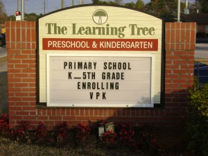
Effective signage is a complex matter that when mastered can be a huge source of recognition, and more importantly, revenue, for your business. Churches, schools and daycare’s especially gain valuable visability with the above shown changable message signs. Shimp Sign & Design is in the business of making sure your signage is an attractive, beneficial part of your company. Let us know how we can help!


