Different Sign Styles
Are you trying to think of a great sign for your business? It can be difficult to think of a good design, especially if it’s not something you’re used to doing. There are all kinds of elements involved; fonts, colors, logos, etc. For this blog post, let’s take a look at some different sign genres. My favorite signs are exterior signs, so let’s start with that.
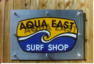
 AQUA EAST Here’s a wall sign for our friends at Aqua East. It’s a unique design. Start looking at other signs when you’re out, how many signs do you see like this? Along with its uniqueness, it’s physically attractive. This is important because in this world of excessive advertisement it’s the stand-out sign that draws people’s eyes and therefore business. What makes this really cool is the raised plexi-glass look.

OCEAN ARROW This is another beautiful wall sign. It’s a more classic design with a modern flair. The foam letters are mounted on stained wood. Notice the black and yellow and how well they go together, an excellent example of the proper use of colors.
THE ISLAND DENTIST I was going to leave this sign out of this blog. I wanted each sign to be different in style in order to present a broad spectrum of sign designs. I just can’t help myself though, this is one of the best examples of color usages. I have previously mentioned the importance of the impression that signs leave on people. Isn’t this a calming image? It looks like paradise, what a great idea for a dentist to use this scene. The impression it gives is relaxing and inviting.
WILLIAMS PLANT NURSERY Here’s what we call a two post sign. A two post sign has its advantages over other signs. It is easily installed in virtually any location. Ideally you want it facing a busy road for passers by to see. This is a great advertisement, notice how large the letters are. These styles of signs are also easily dressed up with a variety of landscaping.
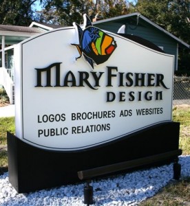
MARY FISHER DESIGN I think this is one of the more ‘striking’ signs. I like the black letters on the white background, classic. The logo is highly stylized (designed by Mary Fisher Design). The ‘M’ and ‘R’s in it have a subtle flair that is appealing. The fish speaks for itself, eye-popping. It is also a ground sign. It’s called a “monument sign” because it’s solid from top to bottom.
CLAY COUNTY UTILITY AUTHORITY I had to save the best for last. This is for the water utility company. They wanted to go big so they got it! The spicket appears to be bronze but it’s foam. This is one of those signs that steps out of the realm of advertisement and into the world of art.


